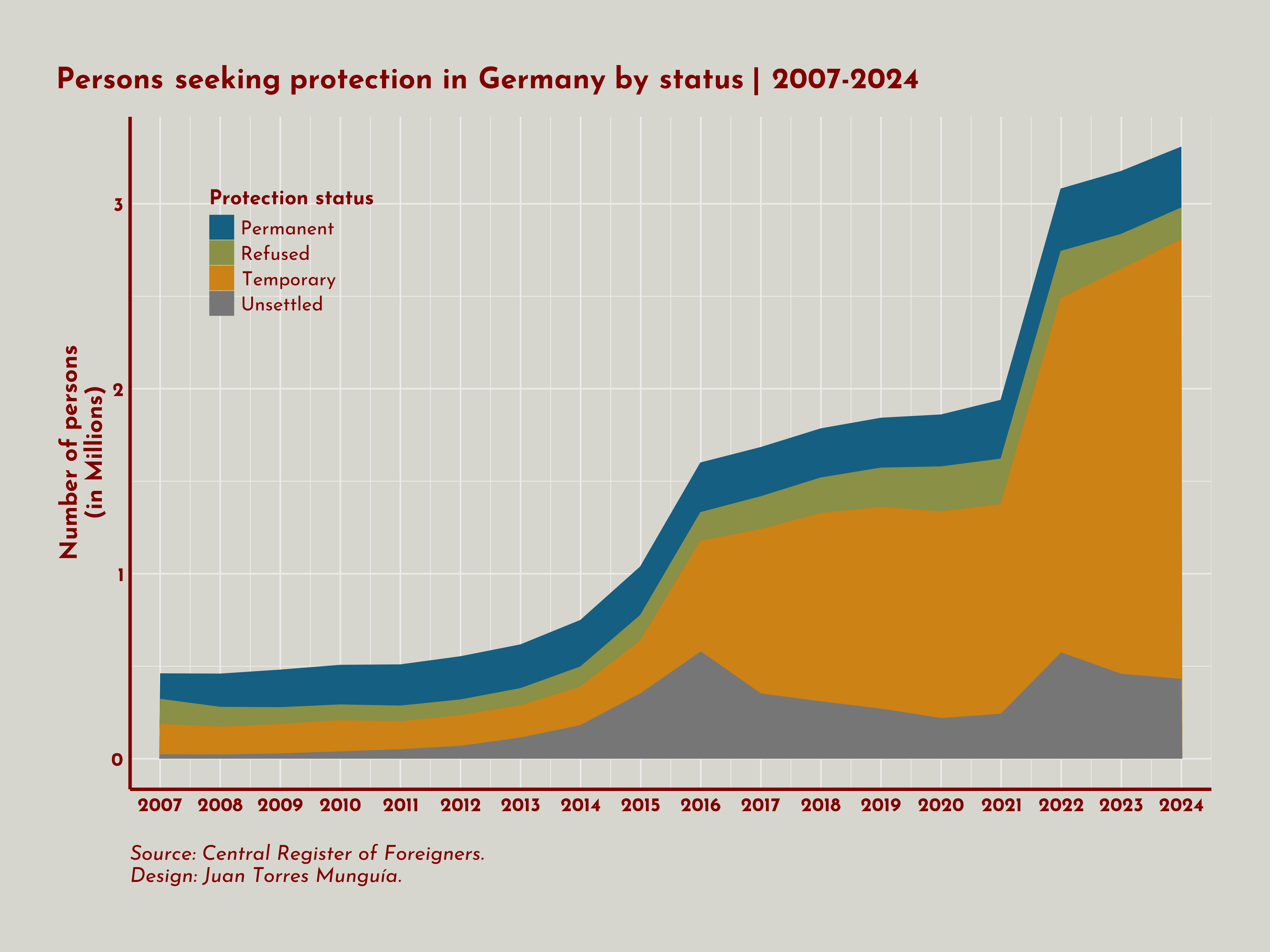
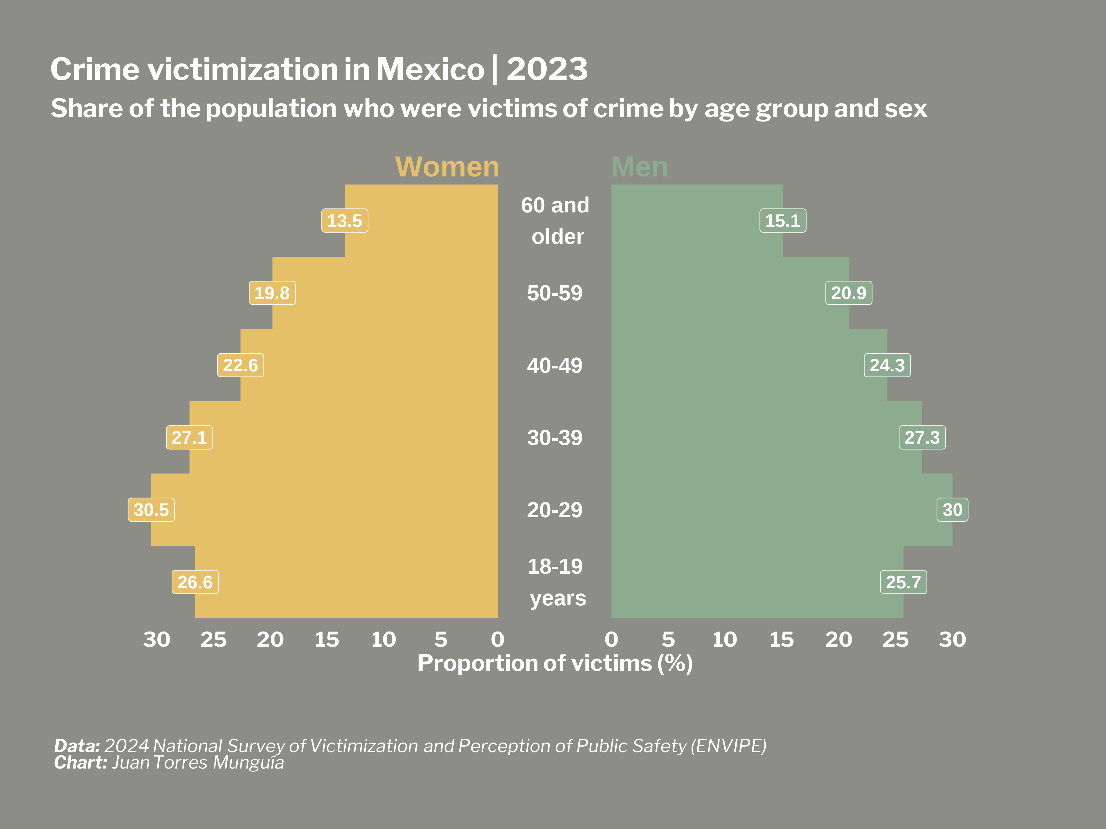
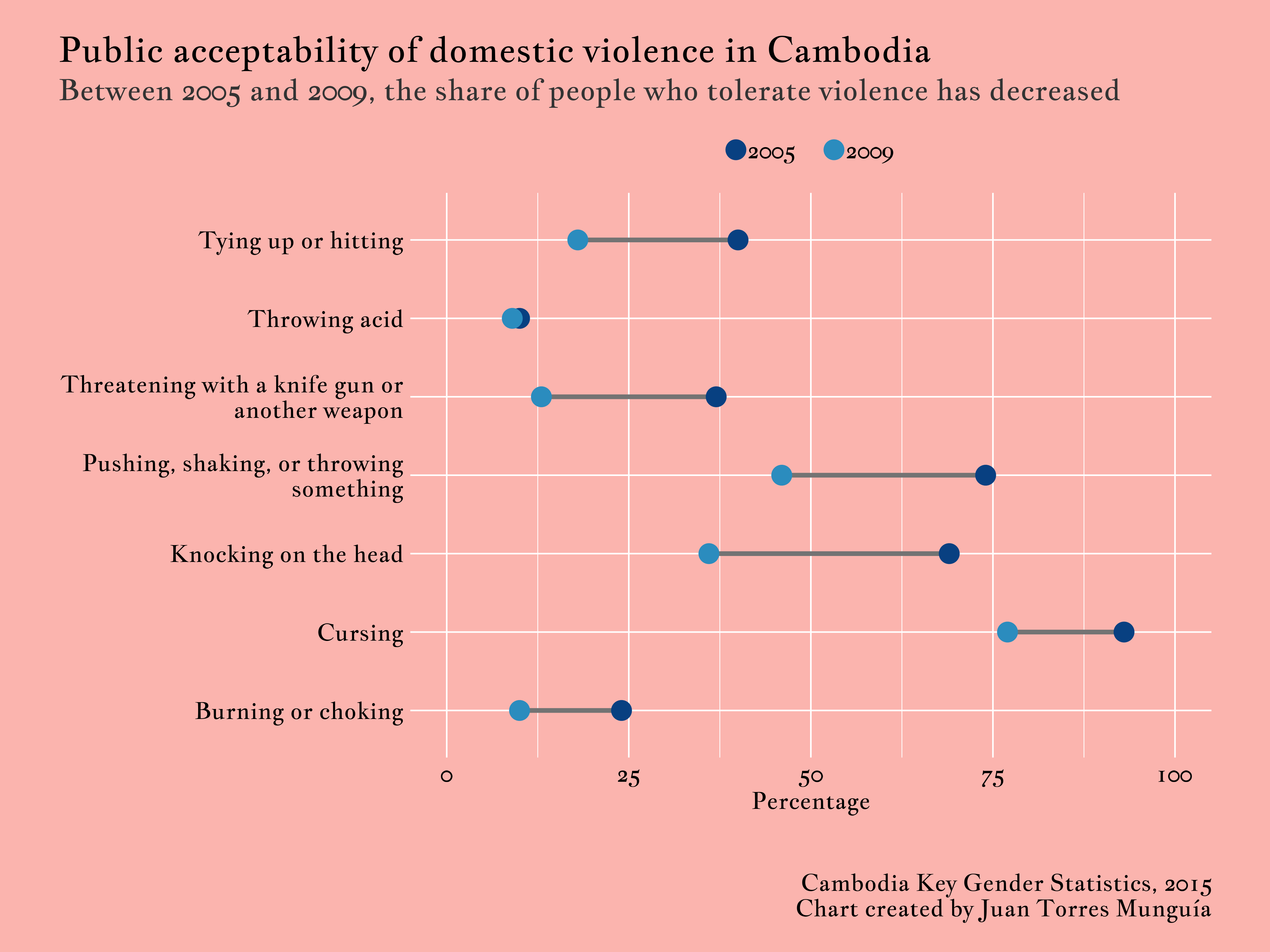
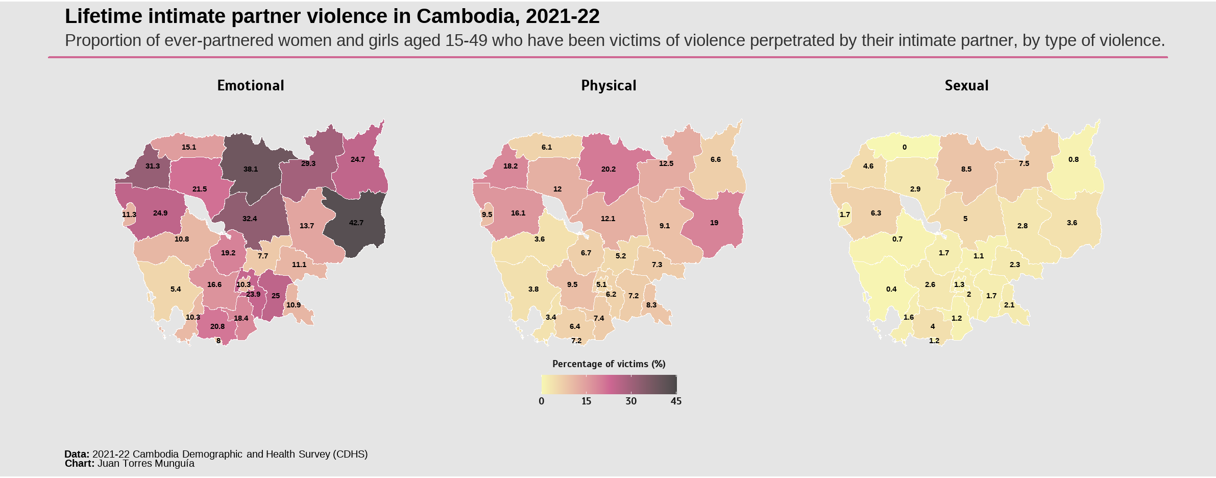
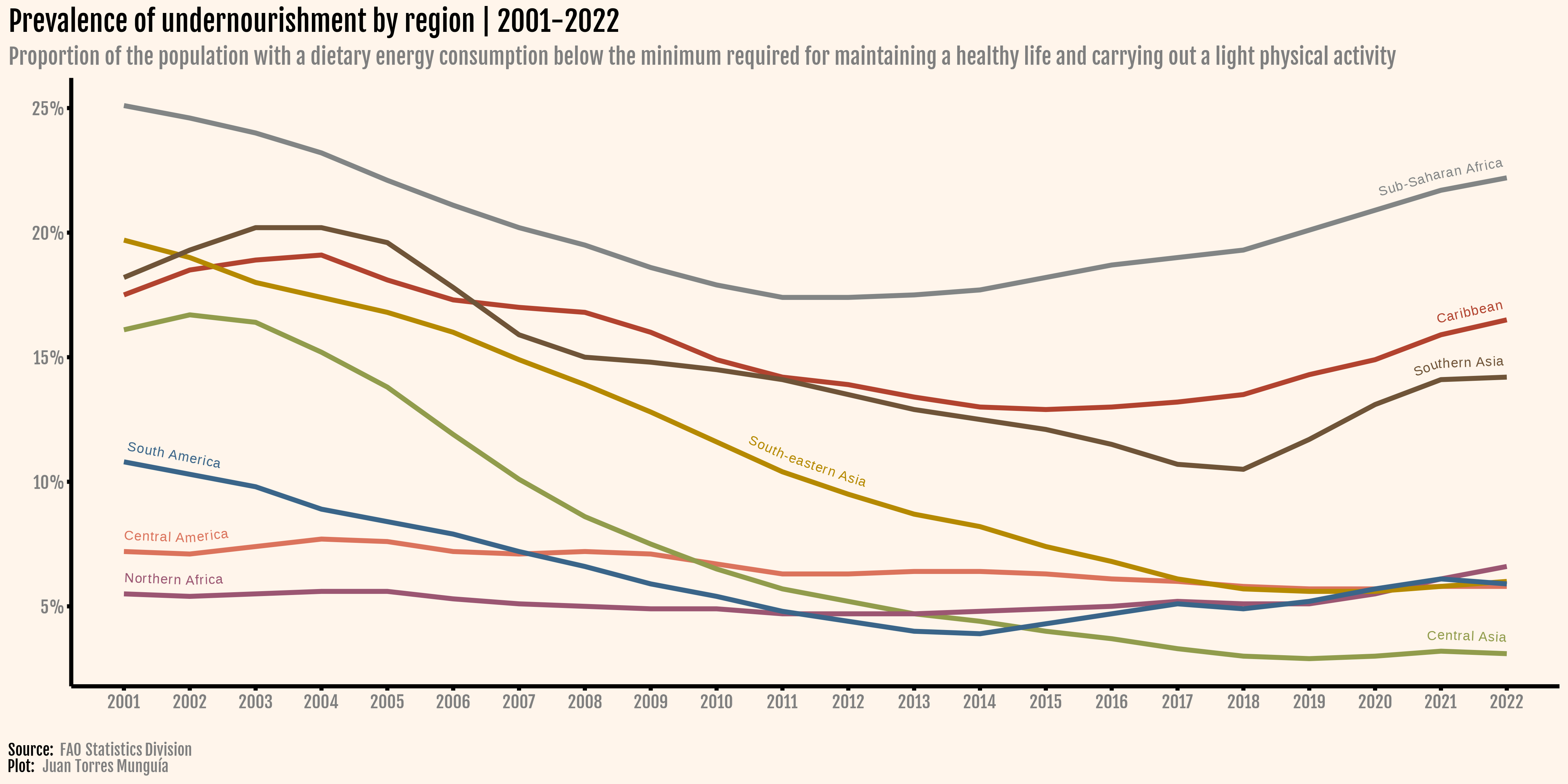
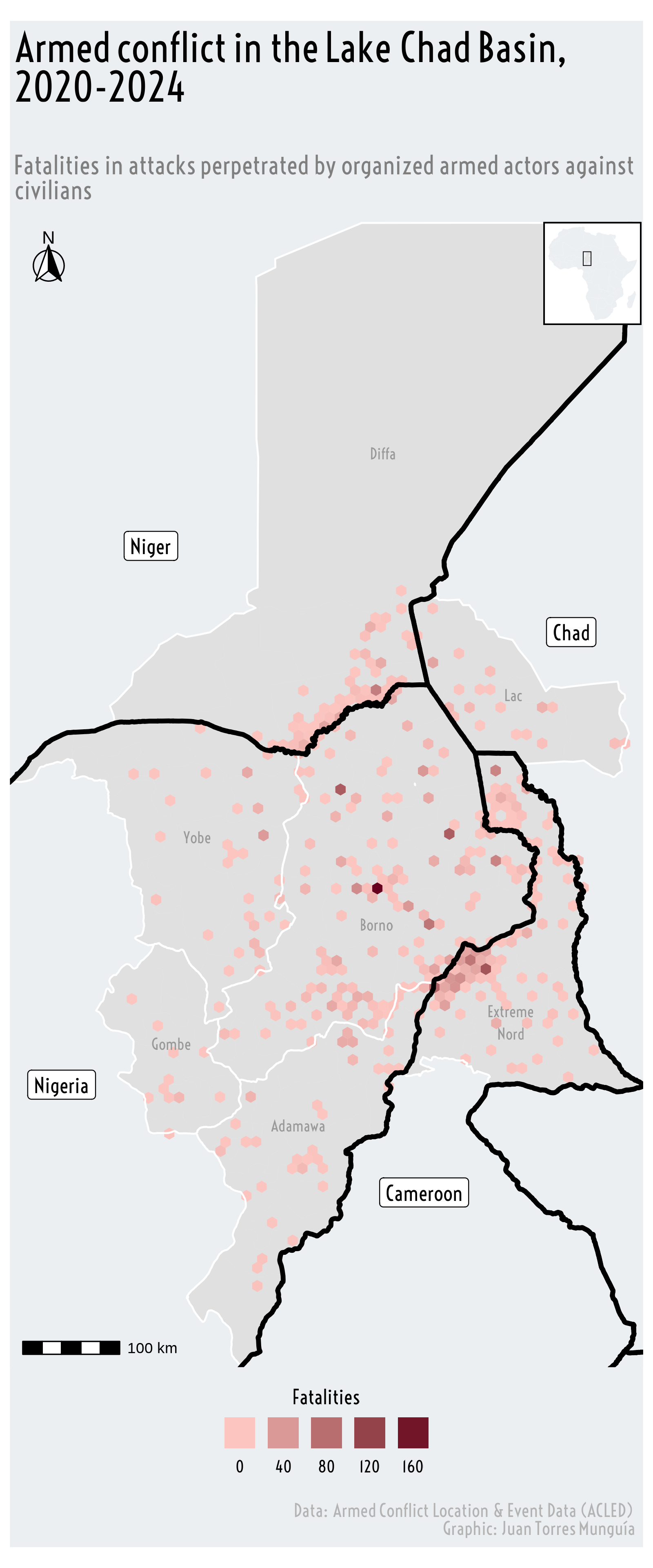
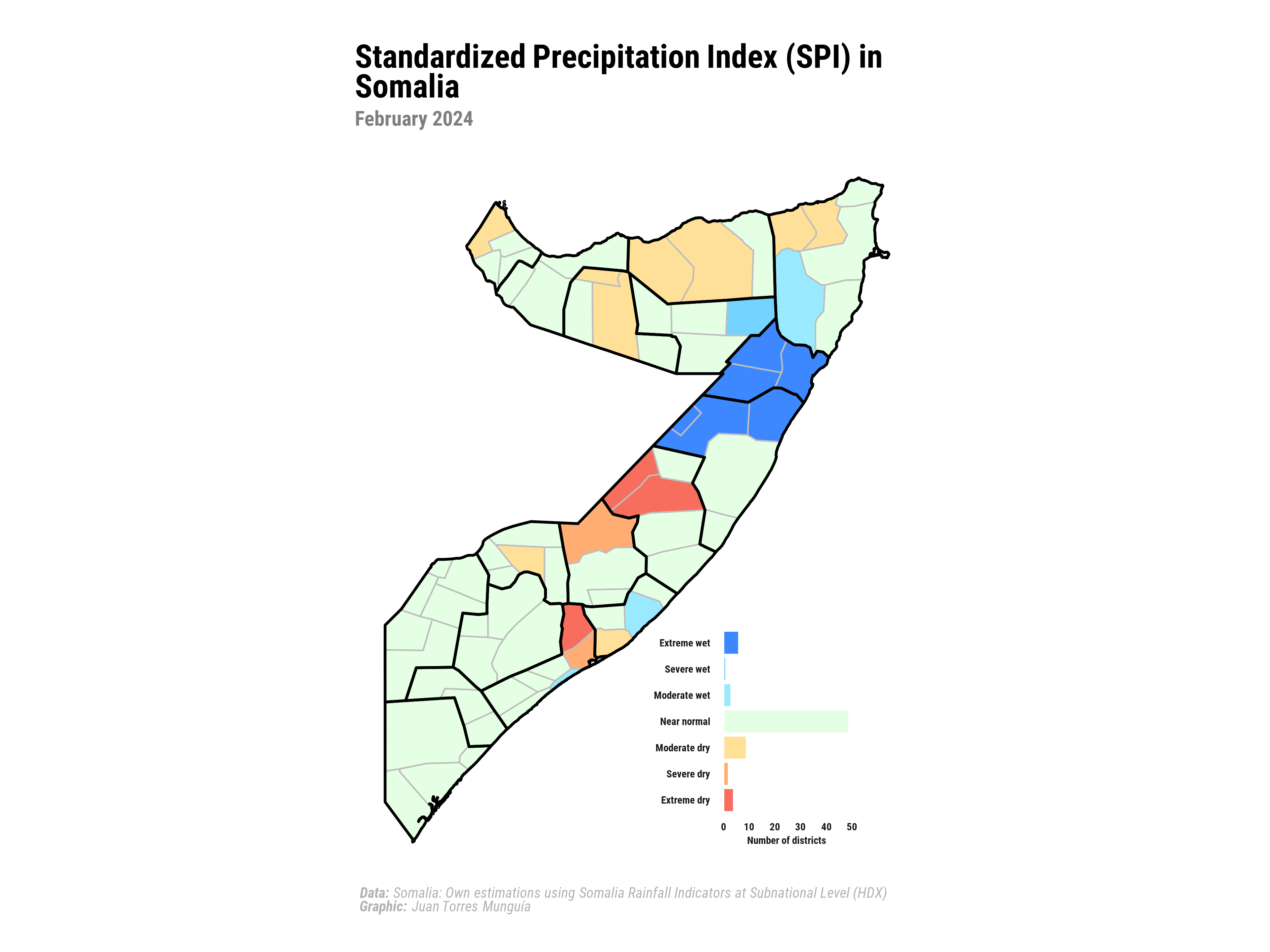
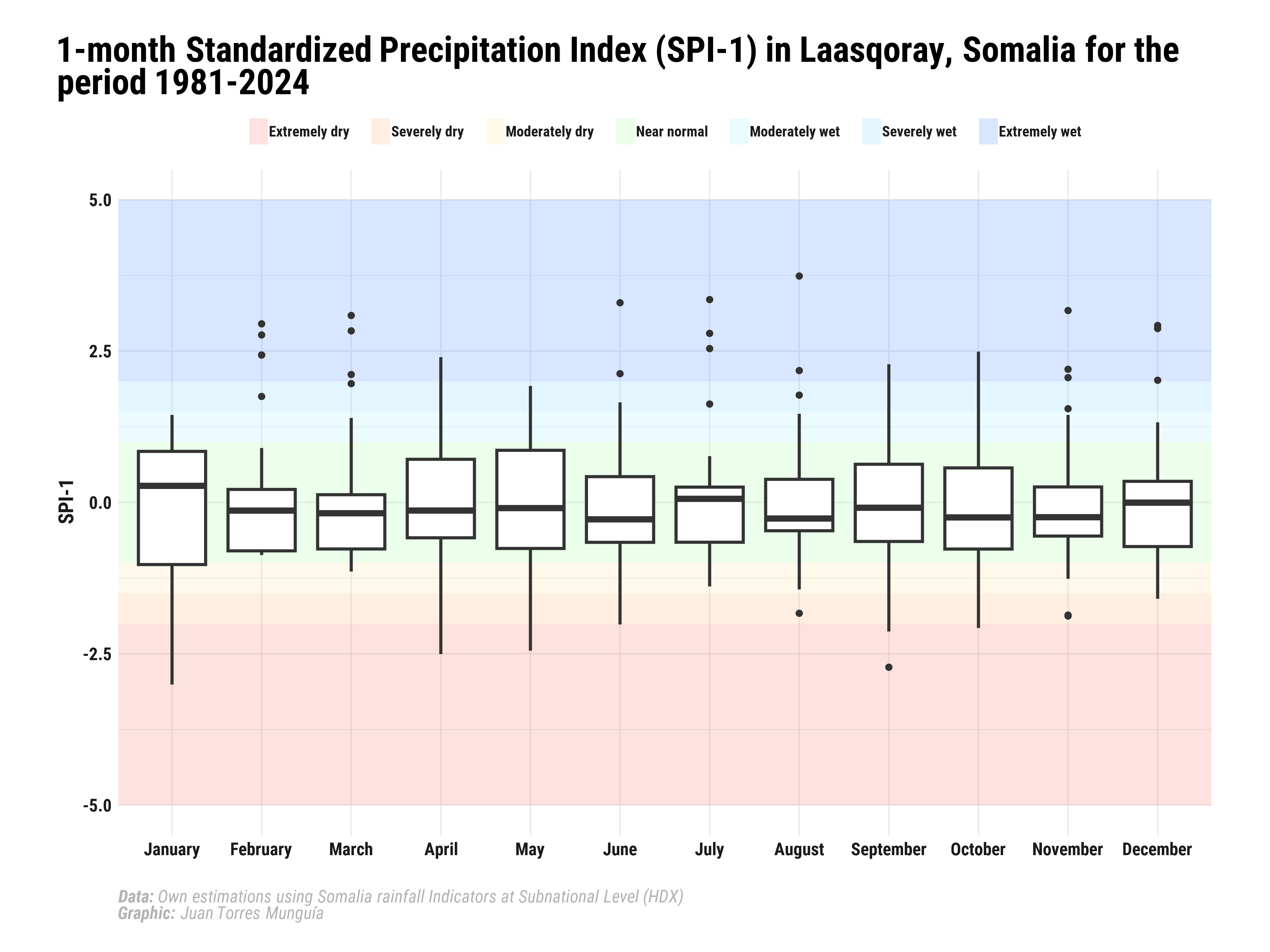
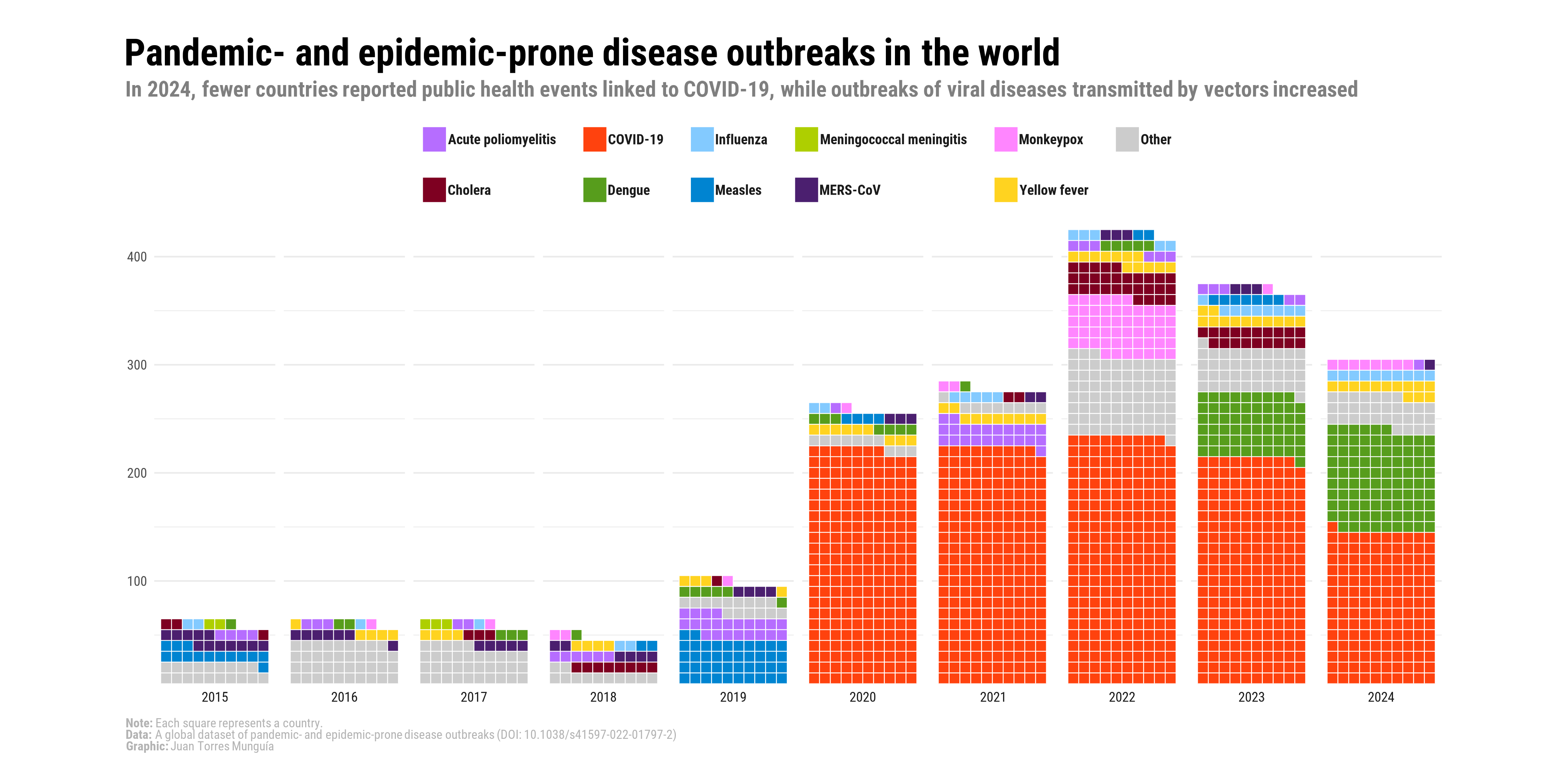
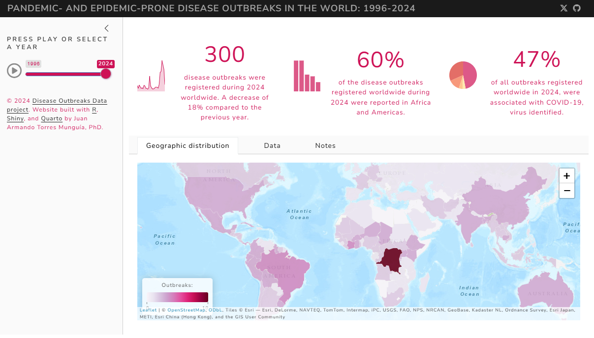
A collection of charts I designed to visualize development and humanitarian issues
Photo: Diagram of the causes of mortality in the army in the East (1858) by Florence Nightingale. Via Wikimedia Commons.